Have you ever taken a picture and then been disappointed, because it didn’t capture the moment? Maybe it looked exactly like what you saw, but when you viewed the image afterwards it was lacking something.
This is one of the greatest challenges photographers face, to express a feeling or vision in a two-dimensional medium. One of the most overlooked tools in the photographer’s processing kit is color.
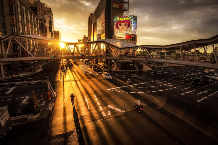
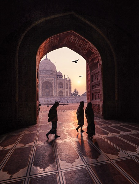
Example of a warm split tone.
I’m not talking about the color of the things in your photograph, like a red car or yellow dress. I mean the overall color cast, the tone of your image, is important too.
Colors affect the way people feel, so much so that there is a whole body of science around it. Even some basic knowledge of color theory can help improve your photography.
Beyond White Balance
The first place to head when you want to change the tone is white balance. For instance, if it’s a gray cloudy day you might want to move the temperature slider towards the warmer side, making your image appear more yellow-orange, or sunny. Move it in the opposite direction, and your image will get cooler or more blue.
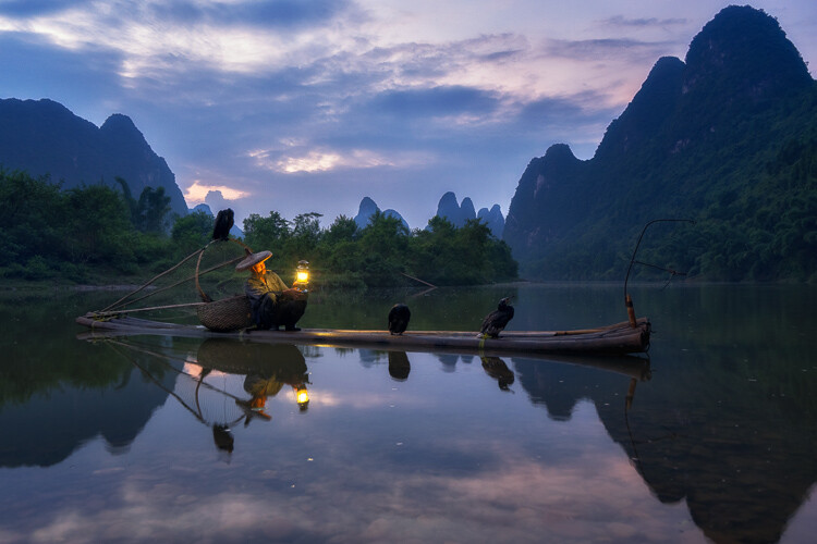
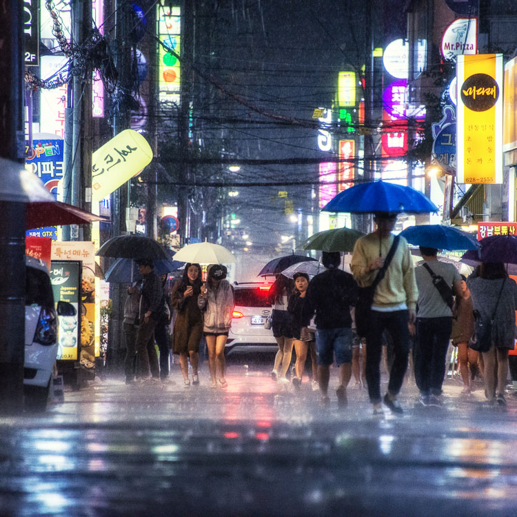
Example of a cool split tone.
Although changing the white balance of an image is helpful, it is still a global adjustment – it affects the entire image. In other words, editing the tone of your image with just the white balance is like a mechanic trying to fix an engine with a sledgehammer. It may not be the right tool for the job.
To make more fine-tuned adjustments, and thus have greater control on the overall mood of your images, you may want to have a look at Split Toning.

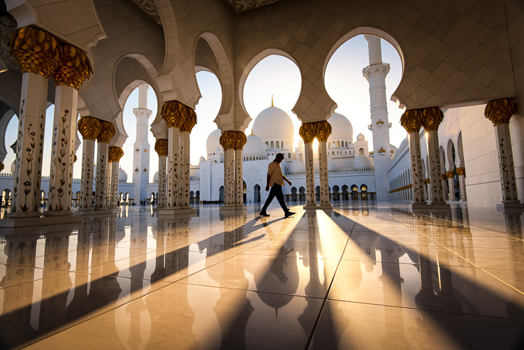
Magenta and warm tones.
A Bit of History of Toning
Toning first started as a way to change the color of black and white photographs. For instance, in the past, chemicals were added to the development process to give prints a sepia tone. Later on, other chemicals toners were used to give images two different tones like red and blue.
It may sound complicated, but in today’s digital darkroom, all split toning really means is that you add color to the shadows, highlights, or both. There are a number of ways you can split tone an image. One of the most common is to make the highlights yellow and shadows blue or vice versa. However, let’s take a look at how you can also adjust a single color, to create a particular mood in Adobe Lightroom (also possible in Photoshop and Bridge).
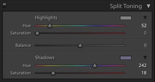
This is what the Split Toning slider looks like in Adobe Lightroom.
Magenta Zen
My favorite color cast to add to my images is magenta. Like a yin and yang varnish, this color (a purplish-red) represents harmony, balance, love, and personal growth. It has a calming effect that stimulates creativity and happiness.
When split toning for magenta, I usually make my adjustments to either the shadows or highlights. I rarely make changes to both, as it tends to be overkill. More often than not, I adjust the shadows, as it’s usually the underexposed darker parts of the image I am trying to bring out. If the image is very bright then I edit for the highlights.

There is no rule as to how far you should move the sliders. However, I tend to move the hue slider somewhere between 230-250 and the saturation slider between 10-20. It all depends on the image and the intensity of the colors, shadows, and highlights. You can also use the eyedropper to choose the color.
Another added bonus to adding some magenta is that it tends to take off the rough color edges. Browns, greens, and yellows are smoothed out, giving your photos a softer tone.

Split Toning Keyboard Shortcuts for Lightroom
There are a couple of shortcuts in the Lightroom Split Toning panel you’ll want to know about.
First, it can be difficult to to choose the right color when the saturation strength is low. To briefly boost the hue up to %100 saturation, just press and hold Option on Mac (or Alt on Windows), then move the hue slider to either side. This will show the color at full strength so you can select it more easily.
Second, to more easily view the colors split in the image, hold down Option/Alt and then drag the Balance slider in the Split Toning panel.
Experiment
Split Toning is much more than just magenta. Try adjusting the warmth or coolness in your photographs in the split toning panel, instead of using white balance for something different. You can also give your photos a cinematic feel, old film look, and more by split toning. Have fun, get creative, and find what works for you.
The post How to Use Split Toning to Make Your Photos Stand Out by Pete DeMarco appeared first on Digital Photography School.