Whatever level of photographer, you are sure to have gathered a stockpile of pixels.
It’s just the way it is nowadays. Whether you are the kind of person that clogs up their hard drive, gradually slowing your Mac or PC down until you are forced to do something about it. Or perhaps you are already super organized having kept negatives, CDs, DVDs, hard drives, a raid system or even the cloud?
Indeed whatever storage method you choose you need to catalogue the files by name, event, and year, so you may retrieve without having a complete breakdown while searching for your favorite file. After all photography should be fun, not pain.
Many photographers use Lightroom, which is a great program, not only for editing but also for organizing your ever-increasing pile of pixels. But then what? What do you do with them then? I think you would agree we all spend too much time in front of screens? So why would you keep your masterpieces locked away in digital format?
To create that killer slideshow you will amaze your friends with is a lot of fun, especially if you have a large TV or digital projector. However, be careful of the content of your slideshow. Nothing worse than visiting a friend, only to be subjected to look through every snap taken on their holiday. Slideshows really should not be much more than ten minutes long or people generally loose interest. Keep them simple also, not too many whizzy effects, that just makes your viewer feel queasy!

So you have this catalogue full of great images, what next? I would say enjoy them. Have your favorites printed and framed. Photography is personal, just like any other art form. By printing your special images, and hanging them in your home, you are not only enjoying the fruits of your labour, but also creating personalized wall art. This shows friends your talents, without the need for a longwinded slideshow.
You may find as time goes by, the framed photographs mean more or less to you. This is quite natural as we grow, and our taste and habits change also. Not to worry, you can always replace them with fresh images. It’s not like the old days when the portrait your parents had remained in the given spot forevermore. In fact, it is refreshing to change your images from time to time. Just like wallpaper or any other interior design things, move on. Only when you can look back at a photograph you made perhaps 10, 20, or 30 years ago, and still love it, will you know it’s a keeper!
My background is a portrait and wedding specialist. Lets take a look at an image from my portfolio. I will describe the process from capture through editing, and finally the framed piece for the wall (above).
#1 – Get it right in-camera
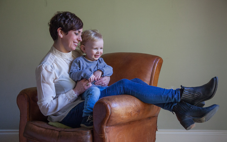
As you can see the old chair, and soft natural light, was perfect for the basis of this portrait. I positioned the mother in the first third of the image, placing her legs over the arm of the chair for a more relaxed contemporary look. My directions to her were simply to get close, and look at your beautiful boy. All I had to do then was to get the toddler to look in the right direction, with the expression to fit. A squeaky toy often saves the day!
The mother is in profile, while the toddler is in three quarter face, adding interest and different angles to the image. The lighting was a large window (not with hard sunlight) off to the right. I also placed a reflector just below the mum’s boots, to bring light back into the eyes and softly wrap around into the shadows. The exposure was 1/250th (freezing the toddler) with an aperture of f/5.6, using a 70mm focal length, as my back was pressed against the far wall of the room.
So to summarize; I feel the expressions are captured well. The lighting is fitting, being soft and directional. The image has style, and is well balanced compositionally. But it just needs something more. The capture stage is so important to get right. Photoshop should not be regarded as a fixer. The great Ansel Adams talked about “printing virtuosity” and just because we now craft our images on a screen, as opposed to in the darkroom, quality and finishing are still paramount.
So take a look at the edited image below.

#2 Basic adjustments in Photoshop or Lightroom
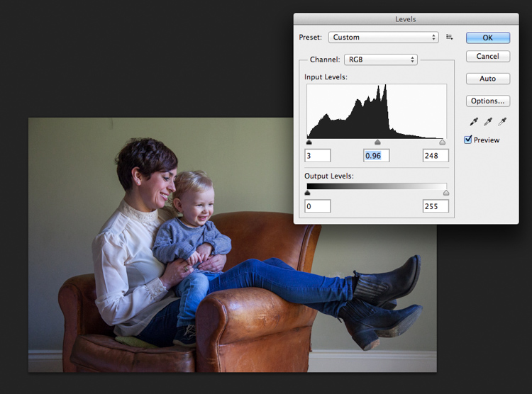
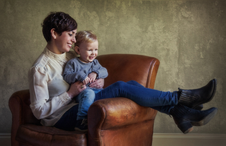
Firstly, you will need to level the image in Photoshop, bringing the sliders in to just clip the histogram at both ends. This ensures depth in the blacks and good clean whites. The mid-tone is really your X factor, but just be aware that you have detail throughout all tones if that is the look you are after. Be careful if you make it too light, the image could appear milky. While if you make the mid-tones too dark the image could appear muddy.
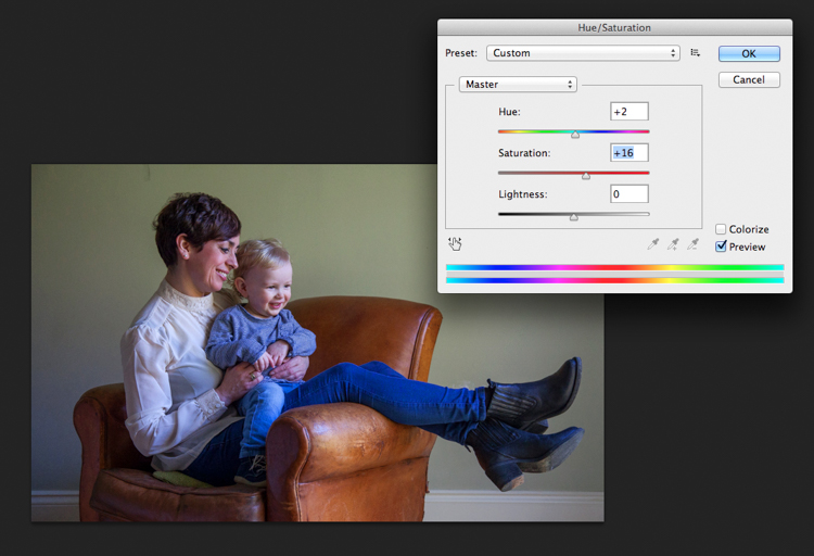
Secondly, I have adjusted the Saturation and the hue of the image to achieve the color pallet I require. Often you can go between the levels and saturation, and make small tweaks as the image takes shape.
#3 – Add a texture overlay (optional)
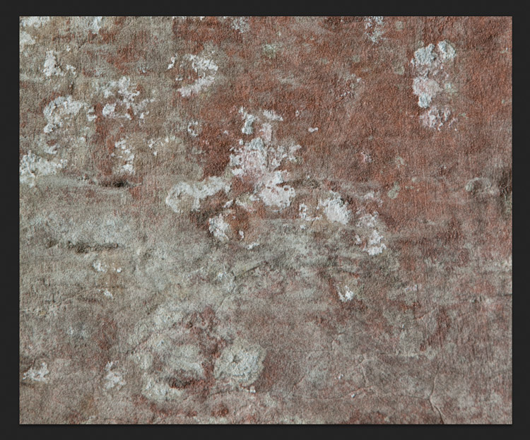
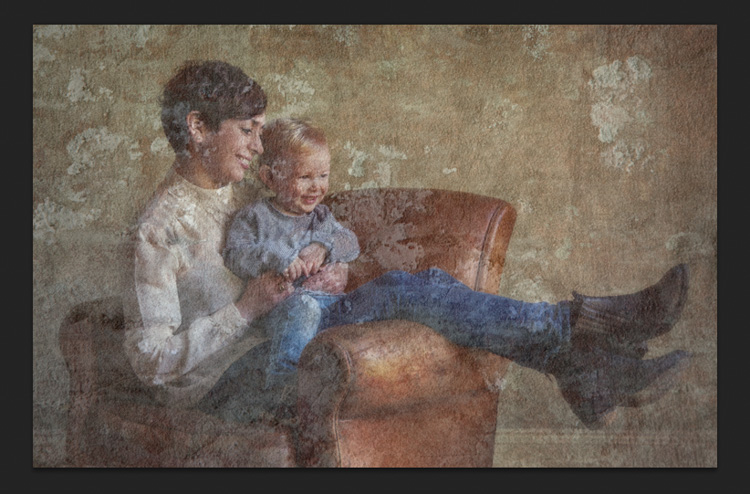
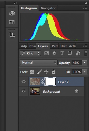
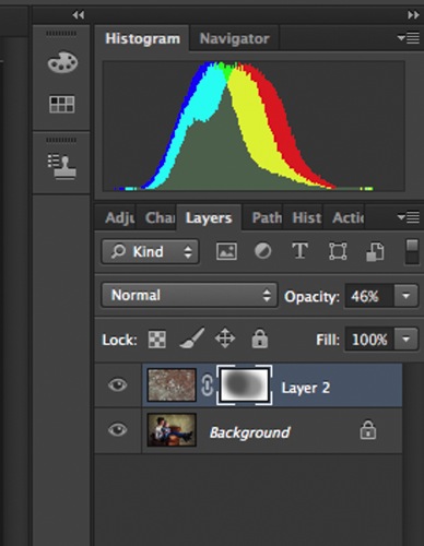
Next you could do as I have here, added a texture overlay. I felt it complimented the chair in its shabby chic style. I photographed a piece of wall, then blended the two images using opacity in the layers pallet. I added a layer mask, then rubbed through with a soft brush to create the subtle look you see here. I then added a soft Gaussian blur from the PS filters, blending the two layers together.
 |
 |
#4 – Local tone control
Finally to complete my image I needed to Dodge and Burn. As you can see this really is a subtle finishing skill, and should not be left to a Photoshop filter. In a future article I will explain exactly how to dodge and burn your images like a professional, directing the eye of your viewer to the important parts of the image. But for now, let’s see the final piece as it was hung on my gallery wall.
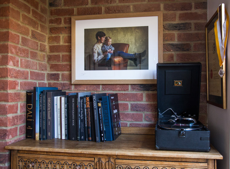
#5 – Print it
I have printed the image on Fuji fine art 300mgs rough texture paper, which I love. The paper is not only excellent for color rendition but has a wonderful tooth to it, adding texture and depth. I have framed the portrait in a simple natural oak and white acid free mount. I have chosen clear glass. Although there is much talk about non-reflective glass, this simply flattens and dulls the image; I would not recommend it. The finished portrait compliments its surroundings, and fits well into the décor and given space.
As I said at the start of the article, it’s important to display your favorite images rather than hide them away on a computer. I am happy to share with you, that I have done just that here. This is my girlfriend Yvonne and my son Miles.
Some photographers prefer to print their own images. This can be a very good way of speeding up workflow and achieving exactly the right colors you require. In recent years printers have became smaller, and inks and paper more archival. I will perhaps invest this year simply for ease of use, and meeting clients deadlines. Perhaps one issue, according to friends who print their own, is you tend to have a fair amount of wastage profiling papers and inks. If you are not particularly a high volume, large output photographer, ink wells can get clogged up causing spattering of pigment. However I think both these problems are now almost eradicated as technology improves year after year.
If you choose, as many professional photographers do, to use a pro lab you have to close the color loop from the start. I use a Spyder 4, as seen in the screenshots below, and my lab use the Epson 9900 and 4900 for printing the Giclee fine art papers I require.
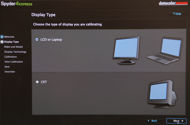
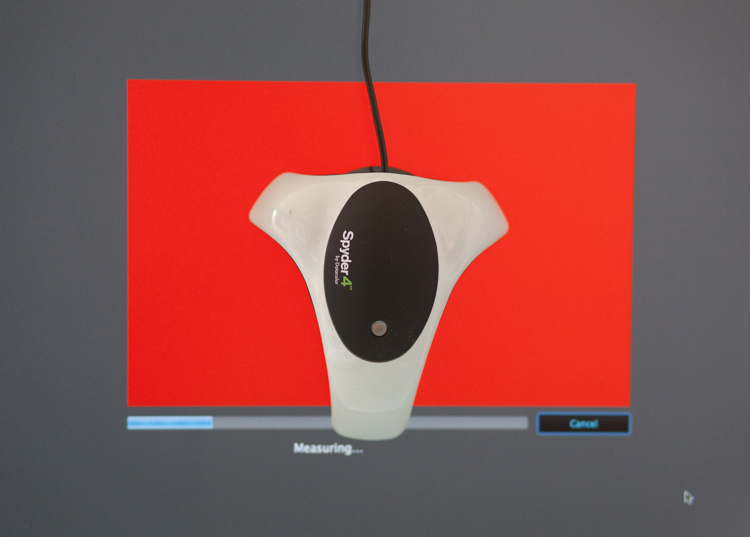
It is attached via USB to your monitor, and simple to follow with onscreen instructions. Basically it brings the colors back in line within the colors space you use. Until recently most labs suggested sRGB, as the colors seen on your screen were pretty much what could be printed. The other often used space is Adobe 98, but not all printing machines can produce such subtleties in color. Progress moves on and there are machines that can print Adobe 98, but my advice for now would be stick with sRGB (ask your lab if you want to know which they use).
Because you are working in a given color space the lab can set its own monitors accordingly, and with a skilled technician the loop should be closed. Sometimes you may find a print is slightly too dark or light. This may be due to the ambient light in yours or your printer’s room being marginally different. A good working relationship is what is needed when using a lab. When asked to reprint an image they should work with you, and offer tips and help if needed; its in everyone’s interest. I rarely have a print that is off, but if I do my lab simply reprints without charge.
So how should you prepare your files? Follow this checklist below for ease of use:
- Always shoot in raw. Much more detail recorded through highlight to shadow.
- Save the raw file but create a working tiff.
- Once you are happy with the finished tiff export as a jpg if sending to a lab.
- Export or print always at 300dpi for best quality.
- Check your prints against your monitor and if adjustments are needed, make sure you talk to your lab first.
- Never compromise composition for print size, i.e. if your image looks better 10×5.5 rather than 10×8, make it that way and drop it on the nearest paper size available. Simply have a mat made to fit your masterpiece.
Do not hang your finished prints in direct sunlight. Like anything that has natural fibers and dyes they will fade. Hung correctly, ink jet prints are now considered very stable, and a alternative to traditional lab chemistry for environmental reasons, but also better quality colors and increased tonal range.
Please share photos of prints you make and hang up on your walls in the comments below. Ask any questions you may have about the process as well and I will try and help you out.
The post 5 Tips for Going from Pixels to Print Quality by Simon John appeared first on Digital Photography School.